Unleash Your Inner Fashion Alchemist
Gone are the days when mixing prints felt like navigating a minefield of fashion faux pas. Today, skillfully combining patterns is one of the most powerful tools in a style-savvy person’s arsenal. When done right, print mixing transforms basic outfits into unforgettable ensembles that communicate confidence, creativity, and a keen eye for detail. Whether you’re dressing for a business meeting where standing out matters or crafting the perfect weekend look, mastering print mixing elevates your style from predictable to profoundly personal.
The US fashion landscape is embracing bold self-expression more than ever, with street style in New York, Los Angeles, and Chicago celebrating those who dare to mix with intention. According to industry experts, mixing patterns and prints is a fashion technique that can elevate your style, add visual interest to your outfits, and express your creativity (luxipo.com). This guide pulls back the curtain on professional styling secrets that have been reserved for fashion insiders, giving you the confidence to create show-stopping combinations that feel authentically you—without needing a six-figure wardrobe.
The Psychology Behind Print Mixing Magic
Why does a perfectly executed print mix stop people in their tracks? It’s not just visual appeal—it’s psychological impact. Our brains are wired to recognize patterns, and when we see familiar elements combined in unexpected ways, it triggers pleasure centers associated with problem-solving and creativity. When you successfully mix prints, you’re not just putting on clothes; you’re creating visual art that communicates your personality, confidence, and attention to detail.
Fashion psychologists note that those who master print mixing often experience what’s called the “halo effect”—where one striking element (like expertly combined patterns) positively influences how people perceive your entire presence. This doesn’t mean going overboard with clashing patterns; rather, it’s about strategic combinations that tell a cohesive story. As highlighted by fashion experts, mixing prints does not have to be crazy or bold—both subtle and statement combinations can communicate sophistication (jaimistewart.substack.com).
“Print mixing is visual storytelling. Each pattern you choose says something about you, and how you combine them creates your narrative.” — Style Consultant Maria Chen
The most effective print combinations share subtle connections that create harmony amid diversity. Whether through color bridges, scale variations, or thematic elements, these connections satisfy our brain’s desire for both novelty and coherence. When done intentionally, print mixing transforms your outfit from a collection of separate items into a unified expression of your personal brand.
Fundamental Rules Every Print Mixer Must Know
Mastering print mixing isn’t about memorizing rigid rules but understanding guiding principles that create visual harmony. These aren’t limitations but frameworks that give your creativity structure, ensuring your boldest experiments still look intentional rather than accidental.
The 60-30-10 Color Distribution Principle
One of the most powerful yet underutilized techniques is the strategic distribution of color across your outfit. This professional styling secret ensures that even daring print combinations maintain visual balance:
- 60% Dominant Color: Your largest surface area (like a dress or trousers)
- 30% Secondary Color: Supporting elements (such as a jacket or skirt)
- 10% Accent Color: Finishing touches (accessories or small details)
This creates cohesion even when patterns differ significantly. For eco-conscious fashionistas, this principle encourages conscious consumption, reduces waste, and makes fashion more sustainable—essential in our current fast-fashion landscape (articles.wifd.in).
Color Connection is Non-Negotiable
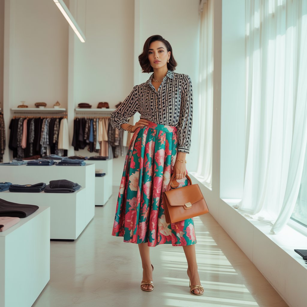
Whether your prints share one strategic color or complementary shades, this visual thread is what makes combinations work. The shared color doesn’t need to dominate—sometimes a single thread in a floral print matching your stripe’s accent color creates the necessary bridge.
Pro Tip: When in doubt, match neutrals! Black, white, navy, or tan elements in different prints automatically create harmony. For example, a black-and-white stripe paired with a leopard print (which contains black) creates instant cohesion.
| Print Combination | Works? | Why? |
|---|---|---|
| Navy stripe + red floral | ❌ | No shared colors creating visual disconnect |
| Black/white stripe + leopard | ✅ | Shared black creates harmony |
| Navy floral + denim chambray | ✅ | Shared blue tones connect patterns |
| Polka dots + plaid with matching accent color | ✅ | Strategic color bridge makes it work |
Print Scale and Proportion: Your Secret Weapon
One of the most overlooked aspects of professional print mixing is understanding how pattern scale affects your silhouette and overall impact. This knowledge transforms good combinations into exceptional ones that flatter your body type and create intentional visual movement.
The Scale Spectrum Strategy
Effective print mixing requires varying pattern sizes to create visual interest without overwhelming the eye. Consider these guidelines:
- One dominant scale: Choose which piece will feature the larger pattern
- One supporting scale: Use medium patterns for balance
- One subtle scale: Incorporate small patterns or textures as grounding elements
For instance, pairing a bold floral blouse (large scale) with pinstripe trousers (small scale) creates dimension, while adding a geometric print scarf (medium scale) ties the look together. This hierarchy prevents visual competition between patterns.
Body Type Considerations
Understanding how print scale interacts with your silhouette ensures your combinations enhance rather than detract from your natural proportions:
| Body Type | Recommended Strategy | Example |
|---|---|---|
| Hourglass | Mix medium and small scales | Bold print top + subtle striped bottom |
| Pear | Larger prints above, smaller below | Floral blouse + fine pinstripe pants |
| Apple | Vertical patterns with medium-scale prints | Stripe skirt + medium-scale geometric top |
| Rectangle | Contrast scales strategically | Bold print dress + fine linear accessories |
Pro Tip: When mixing two bold patterns, always include a solid-color transitional element. A black belt between a patterned top and bottom, or a solid-color cardigan over two patterned layers, creates necessary breathing room for the eye.
As noted by style experts, mastering the importance of size, colors, and grounding is essential to get your print mixing looks absolutely right (highlatitudestyle.com). This understanding transforms random pattern pairing into intentional artistry.
Creating Focal Points: Directing the Eye with Purpose
Professional styling isn’t about making everything stand out—it’s about strategic emphasis that guides the viewer’s eye through your outfit intentionally. When mixing prints, establishing clear focal points prevents visual chaos and creates sophisticated, intentional looks.
The Single Statement Rule
While it may be tempting to go all out with multiple bold patterns, professional stylists follow the “one statement zone” principle. This means designating one area (usually the top half or bottom half) as your primary visual interest, with supporting patterns playing secondary roles.
For example:
- A bold geometric print skirt paired with a subtle stripe top (statement on bottom)
- A vibrant floral blouse with understated pinstripe trousers (statement on top)
- A patterned dress with strategic solid-color accessories to break up visual noise
Transition Techniques for Seamless Blending
The space between your mixed patterns is just as important as the patterns themselves. Consider these professional transition techniques:
- Color Blocking: Use solid-color belts, scarves, or jackets to create intentional breaks between patterns
- Texture Bridges: Incorporate knitwear, leather, or denim elements that don’t compete with patterns but connect them
- Strategic Solid Elements: A simple white tee under a patterned dress instantly creates separation when adding another patterned layer
“The most polished print mixers don’t just combine patterns—they create visual journeys. Each element leads the eye to the next intentionally.” — New York Fashion Editor, Daniel Rossi
Pro Tip: When combining two medium-scale patterns (like checks and stripes), add a third texture (such as a leather belt or woven bag) to break up potential visual competition. This creates necessary contrast that allows each pattern to shine without fighting for attention.
Seasonal Print Strategies: Adapting Your Pattern Play
Print mixing isn’t a one-size-fits-all approach—it evolves with the seasons, responding to changing light, color palettes, and fashion contexts. Understanding seasonal print dynamics ensures your pattern play feels current, appropriate, and harmonious with both fashion trends and natural environments.
Spring/Summer Print Pairings
Warmer months invite lighter fabrics and more color, creating opportunities for playful print combinations:
- Floral + Stripes: The classic warm-weather pairing works because both patterns feel organic and flowy
- Tropical + Gingham: Shared vacation vibes create thematic harmony
- Abstract Watercolor + Subtle Dots: The soft edges of watercolor prints blend beautifully with structured dots
Key consideration: In brighter light, patterns appear more intense, so scale becomes even more critical—opt for smaller patterns when mixing multiple prints in summer.
Fall/Winter Print Combinations
Colder seasons allow for bolder combinations thanks to layered clothing and lower light conditions:
- Plaid + Houndstooth: Both traditional patterns share similar structural elements
- Animal Print + Geometric: The organic meets structured for striking contrast
- Fair Isle + Subtle Stripe: Thematic holiday connection creates instant harmony
Pro Tip: Winter’s lower light conditions actually allow for more visual complexity—what might look busy in summer sunlight often appears perfectly balanced in winter’s diffused light.
| Season | Recommended Pattern Intensity | Fabric Considerations | Top Combination |
|---|---|---|---|
| Spring | Medium to high | Lightweight cottons, silks | Florals + delicate stripes |
| Summer | High | Linen, lightweight blends | Tropical prints + gingham |
| Fall | Medium-high | Medium-weight knits, corduroy | Plaid + houndstooth |
| Winter | Medium | Heavy knits, wools | Animal print + geometrics |
Remember that many successful outfit combinations happen through deliberate experimentation. As one style expert notes, practice is essential—this is a skill you have to develop through experimentation. Try out combinations and take mirror selfies to analyze what you like and don’t like, seeking inspiration in the process (callherstylish.com).
Bringing It All Together: Your Print Mixing Action Plan
Mastering print mixing isn’t about perfection on the first try—it’s about developing an intuitive understanding through purposeful experimentation. The most stylish people didn’t become print mixing pros overnight; they cultivated their eye through deliberate practice and thoughtful observation.
Start small by incorporating one mixed-print element into your existing wardrobe. Perhaps pair a striped tee with a subtly patterned scarf, or add a floral blouse under a pinstripe blazer. As your confidence grows, gradually introduce more complex combinations. Remember to document your experiments—take photos of successful and unsuccessful pairings to develop your visual library of what works for your personal style and body type.
The journey to mastering print mixing is uniquely rewarding because it transforms clothing from mere garments into your personal canvas. Each successful combination boosts your confidence and deepens your understanding of visual harmony. In a fashion landscape increasingly focused on personal expression and sustainable practices, knowing how to creatively mix what you already own becomes both a style superpower and an ethical choice.
Final Pro Tip: Keep a “print mixing journal” (digital or physical) where you document your successful combinations, noting what worked and why. Include photos of outfits that inspired you, whether from street style, magazines, or social media. Over time, you’ll develop your own personalized formula for print mixing that feels authentic to your style identity.
Remember, the goal isn’t to follow rigid rules but to develop your eye for what feels harmonious and expressive to you. As you practice these techniques, you’ll find that mixing prints becomes less about following guidelines and more about intuitive expression—transforming your wardrobe into a dynamic tool for self-expression that evolves with your growing confidence and style sophistication. Your unique print mixing signature awaits—now go create it with intention and joy.